

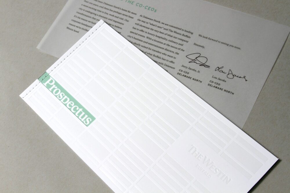

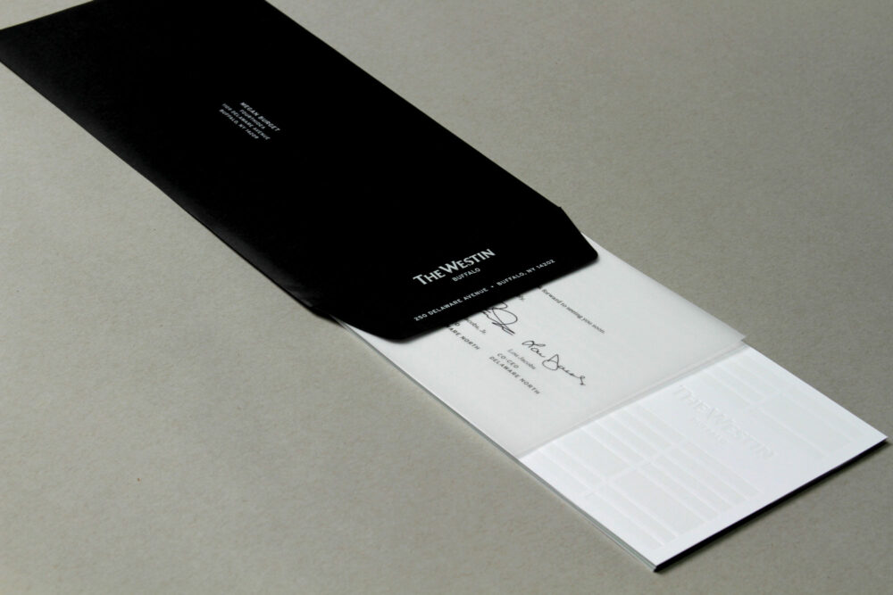





When the Westin was preparing to open the doors of its first hotel in Buffalo, they needed an announcement that would make a bold statement. They wanted something that felt luxurious and one-of-a-kind, while maintaining the Westin brand standards. This piece would be mailed out to an exclusive list of executives and business travelers from the region.
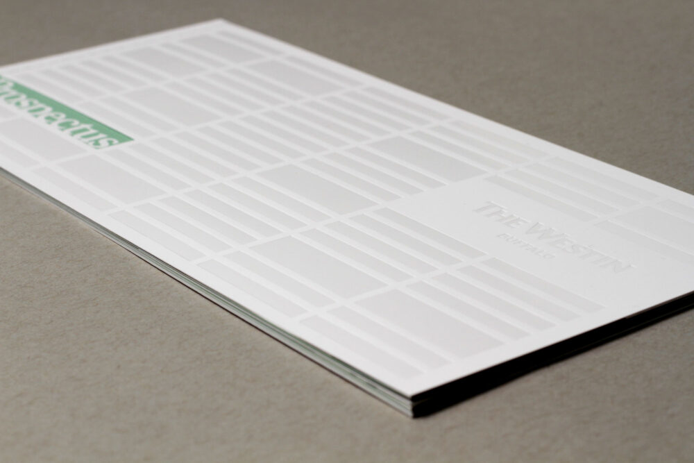
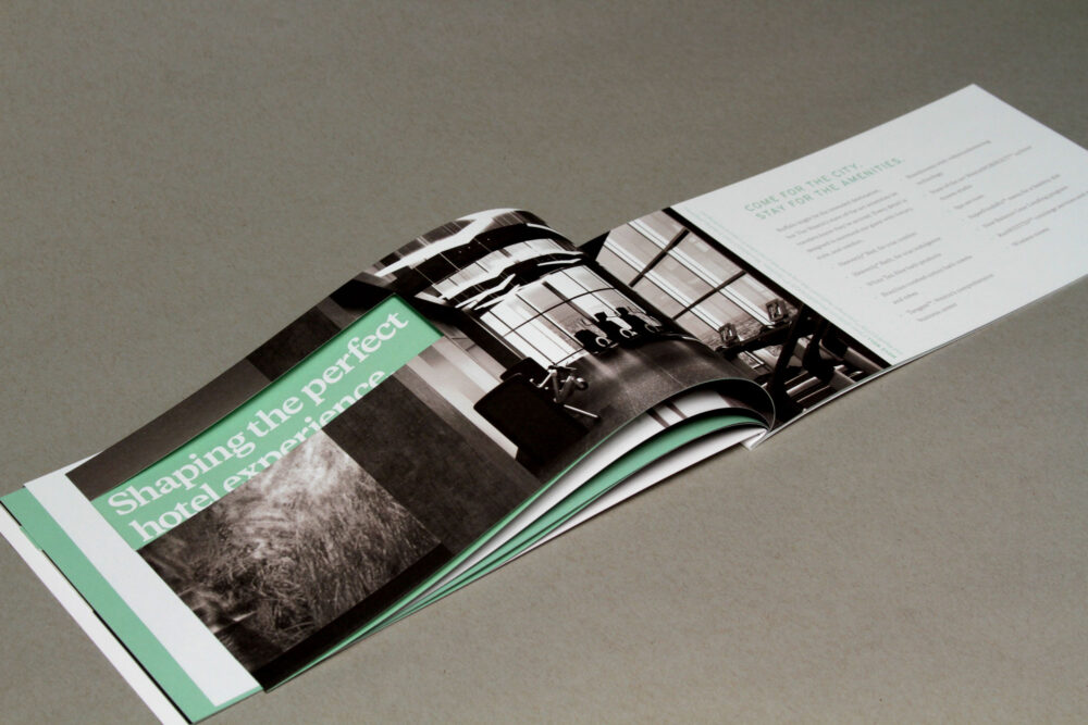
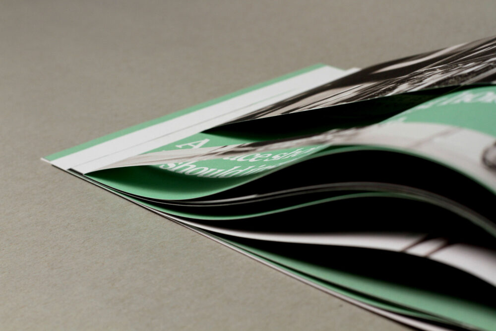
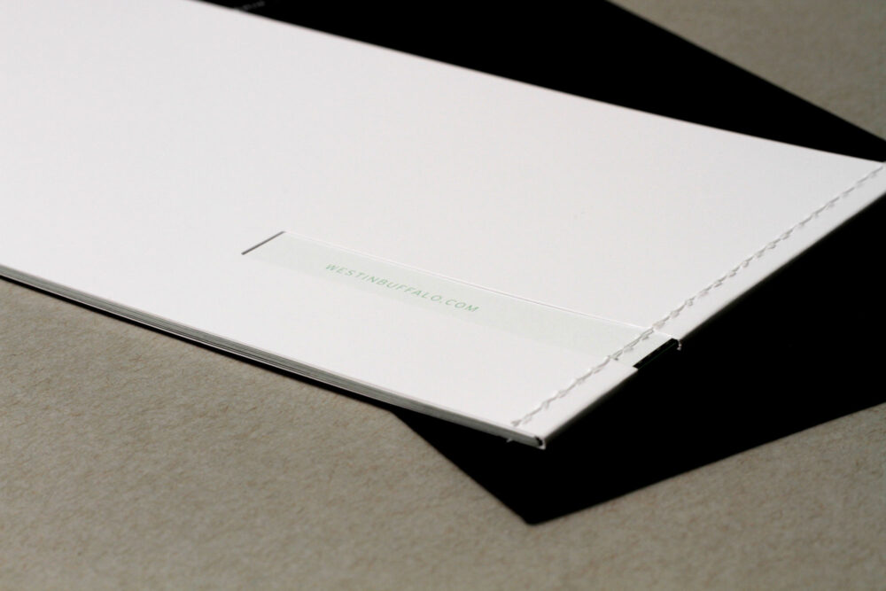
This 24-page brochure was designed to mimic the architectural lines on the exterior facade of the hotel. The cover is a sturdy white soft touch stock with glossy, debossed elements and a white stitched binding. The interior features stunning black and white photography, mint green color blocking, and lots of negative space. French-folded sheets with die cut windows reveal headlines printed on the inside of the fold.
FourthIdea
Westin Buffalo